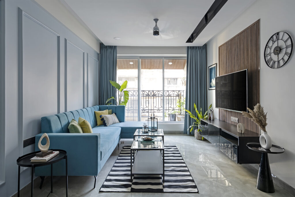
Brief from the home owners was to achieve a space that is calm and neutral, fresh and well lit, open and unrestricted in its function. The Design Chapel was approached to design a minimalist haven with elements that soothe and calm rather than excite and stimulate.
When it comes to typical Mumbai apartment layouts, the home owners put forth two main requirements: one to make the space feel as large and visually expansive as possible and two to maximise storage space. With the use of the right materials, colours and elements, the designer created an illusion of expanse and spatial volume. The task was to make the most of the floor space of this typical 2.5 BHK compartmentalised apartment with minimum turnover time and budget.
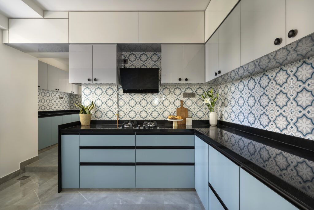
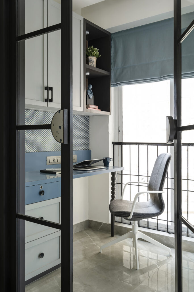
Minimal layering coupled with a play of understated materials created a controlled muted environment interspersed with colours, patterns and textures. The aim was to create a visual dichotomy across the space with the use of blues and greens, a plethora of patterns through wallpapers and tiles, textures through rattan and terrazzo alongside a calming neutral palate.
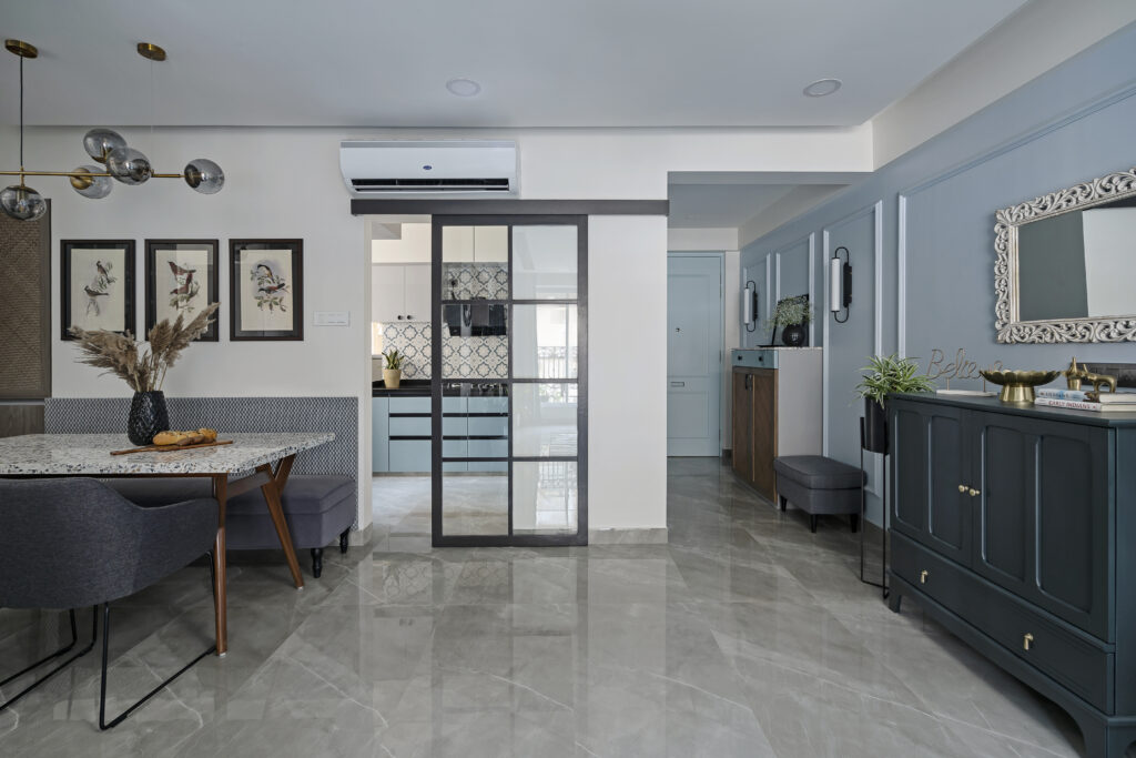
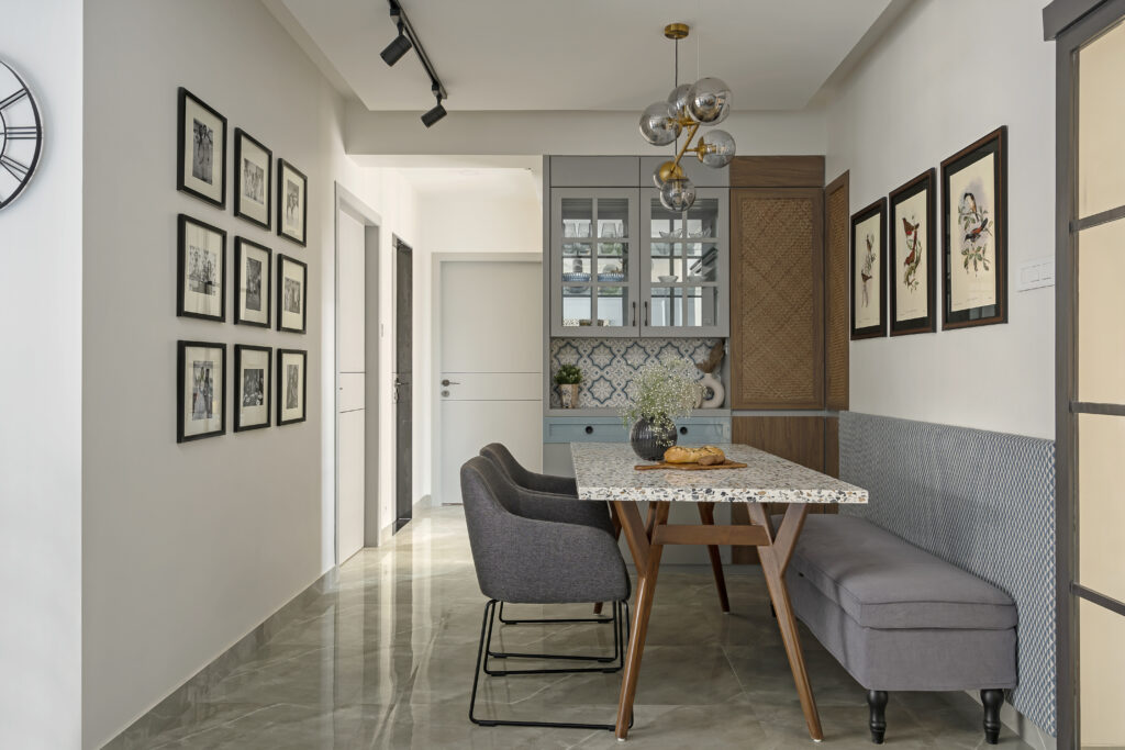
The dining space is conceptualised to add some textural play to the elemental designs. With grey, and wood brown as the primary players, the prints of the tiles, the irregularity of the terrazzo table top, the texture of the rattan sheet and the dining headboard fabric along with the colours of the vintage bird art all create a measured drama of layers.

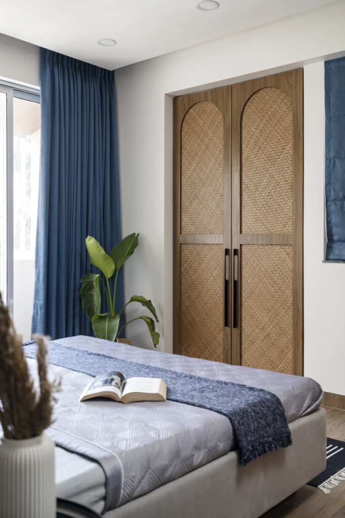
For the master bedroom, the rattan sheets on wardrobe doors with wood and grey forms the primary base.
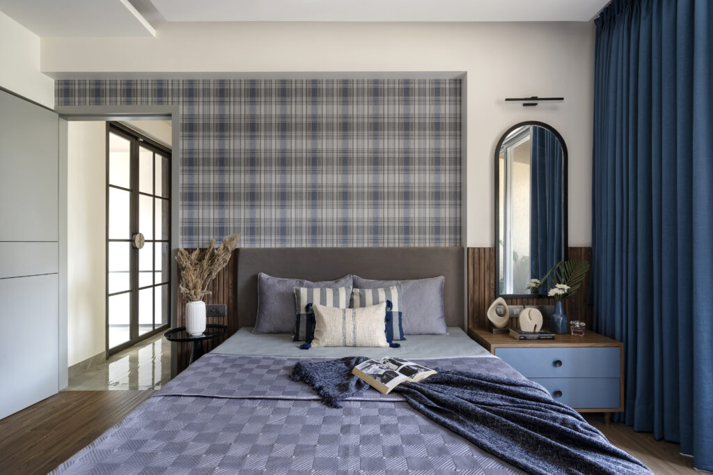
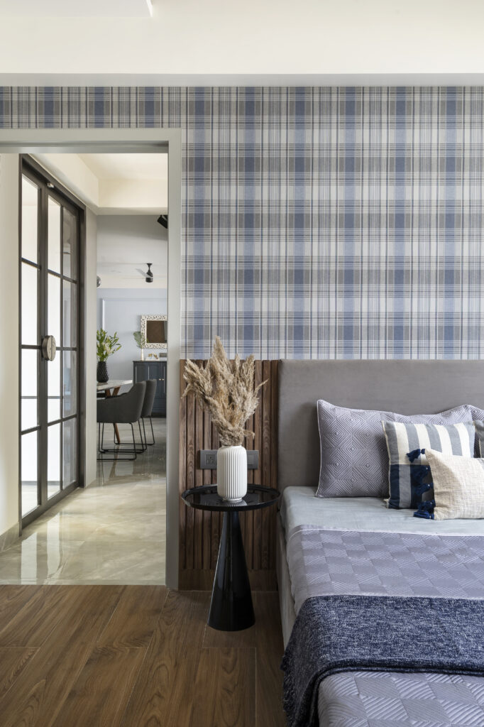
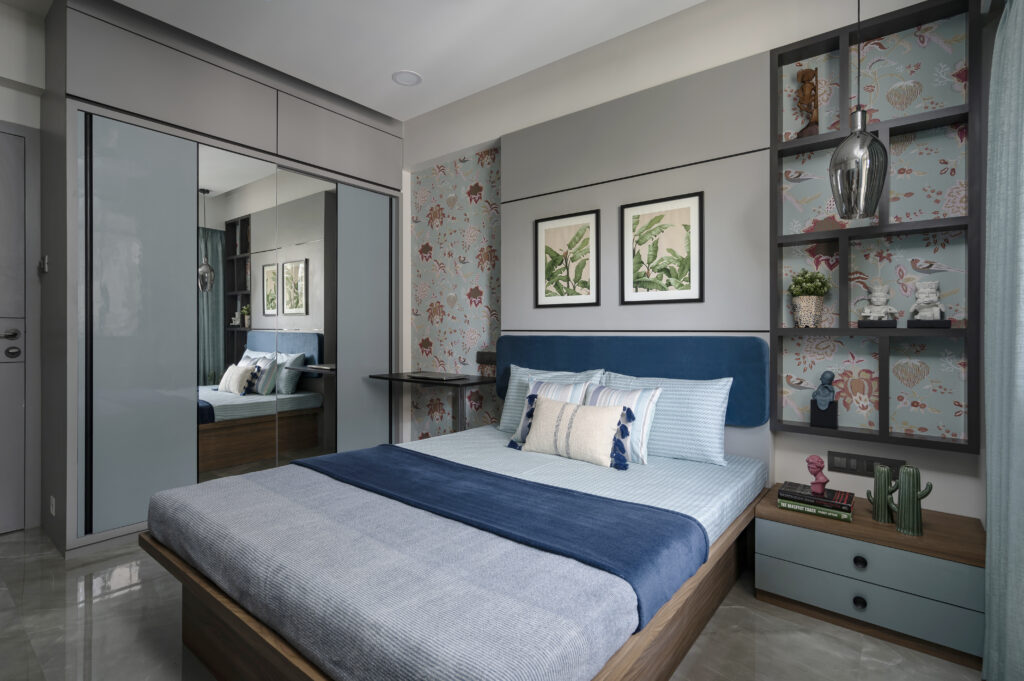
With ample light washing in through the window, the Nilaya wallpaper becomes the piece de resistance of this otherwise simple and muted bedroom. But the true hero is the light which makes the space look expansive. Not shying away from colour with the addition of a royal blue curtain along with hints in the soft furnishings and the fabrics.
The mother’s room is homage to her love for nature. The printed floral wallpaper with birds perched on branches with flowers and the foliage art perfectly complement the base colours in grey and sea green.
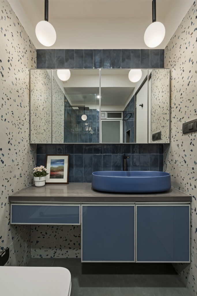
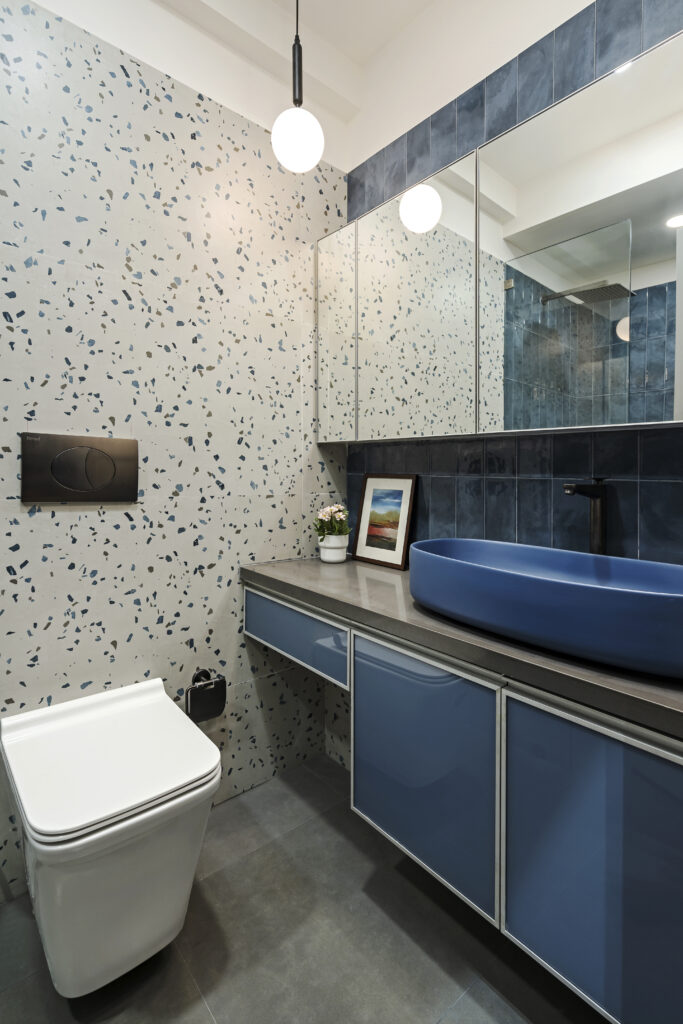
Master Bathroom is designed with terrazzo tiles accompanied by blue and ochre tiles that like the rest of the house stimulate with muted colour and pattern.
The spatial aesthetics for this home are all about continuity in elemental language, colours, textures and materials that create a uninterrupted spatial flow and visual expanse. Every design decision, material and colour choice has been derivative of this thought.
This home is designed not to just add pomp and luxury but invite peace and quietude. Not a house with sensory overload but a home which allows you to listen to your own silent musings. Less is more here as the space successfully balances the scales of various elements to create harmony.
The design of this house is an effort to be sensitive and responsive to all dimensions of body, mind and spirit.
Fact file :
Name of the project : Neutral Bliss
Design Firm : The Design Chapel
Location : Mumbai
Area: 1000 Sqft (2.5 BHK)
Photographer: Biju Gopal
Stylist: Preshita Shah Gupta