Summoning immersive design to the forefront, the Chalk Studio Office draws heavily from its core principles as a dynamic, young studio and translates these into the essence of its headquarters.
Ever-morphing in its form and unafraid to start over.
There is something grounding and tactile about chalk as a humble tool that has outlived its modern contemporaries with silent grace. Every stroke transforms its being while leaving a trace of creation over a canvas. Carrying this nascent sentiment at its heart, the Chalk Studio Office moulds a sanctuary for its inhabitants, embracing the concept of tabula rasa as they revel in the joy of a newfound home. Nestled on the 20th floor of a commercial complex in Gurgaon’s urban heart, the studio makes a home amid panoramic views, witnessing the meeting of endless green pastures, the vast skies, and the humdrum of the city.
Piecing together one’s own creative workspace is a task that is intimate and challenging all at once. While stepping into the shoes of the end-user comes with its own bout of consideration, it also presents a team with the ability to unearth a blank space’s potential that yearns to be explored. The team’s working style fuelled the design process at the primary stages, placing collaboration figuratively and metaphorically at its nucleus. With over two dozen iterations, Vaastu-posed improvisations, and back-end changes encountered while endowing the spaces with a new lease of life, the current state of the workspace establishes an equilibrium between functionality, interaction, and an empowering milieu. Each nook was detailed with in-situ sketches and spontaneous notes, often improvised at the site, best addressing the latter’s conditions and progress.The bare blueprint has been effectively imagined by creating a quality of space that dissolves rigid hierarchy and instead catalyses meaningful dialogue around design. The contiguously woven together zones articulately hold pockets of privacy, collective discussion, and ideation while displaying a homogeneous DNA.
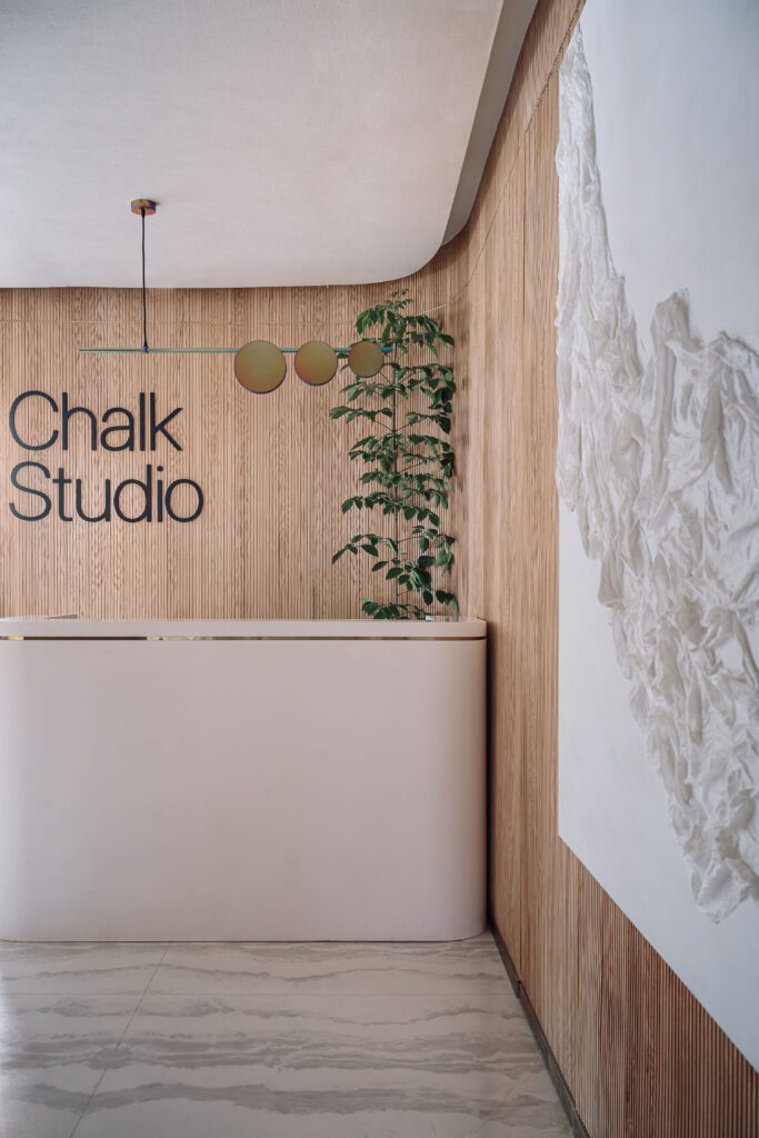
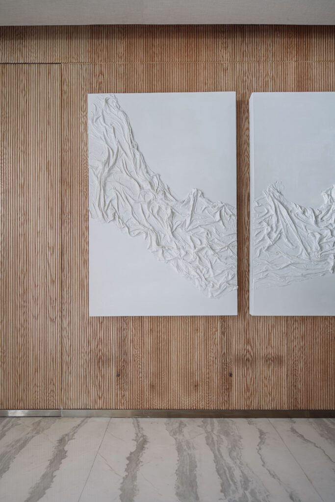
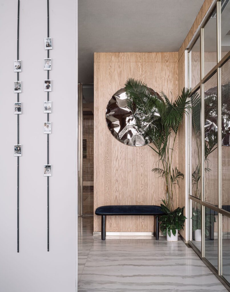
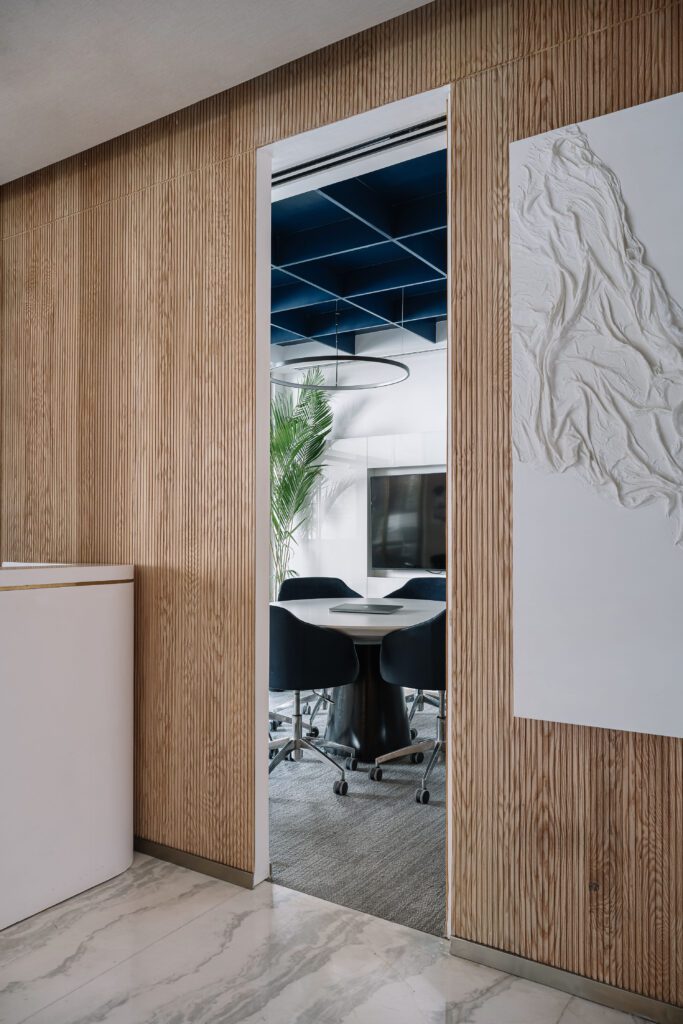
Prefacing the studio, a quaint reception welcomes one into the space. Fluted EvoWood panels envelop the area and exude a sense of tangible warmth. The textured and umber finish meets the veined Statuario marble flooring, fabricating a timeless visual. The bespoke desk is an in-house creation crafted in Corian, underpinning the recurring theme of curved and linear silhouettes. The sleek Hatsu Lino pendant levitates over the desk, softly illuminating the nook. A diptych art installation conceived by the design team has been juxtaposed against the fluted wall, inconspicuously stowing away the fire panel out of sight. The reception turns a corner, revealing glimpses of the workstation bay. A petite deep-blue, upholstered bench by Hatsu rests in this nook. The focal wall sculpture by White Domus crowns this spot evocatively, drawing one’s sight to its lustrous and textured mien. The reception area is flanked by two meeting rooms, enabling ease of access for studio members, and visiting clients. The first meeting room houses a custom round discussion table spanning 5-feet in diameter, built in Neolith tile for a seamless finish. A deep blue hue debuts in the suede-upholstered Shearling chairs, echoing the cobalt blue of the coffered ceiling that displays a bold dose of colour in an otherwise minimalist space. This meeting room also features a 55-inch television and a customisable, physical mood board that come in handy during client meetings.
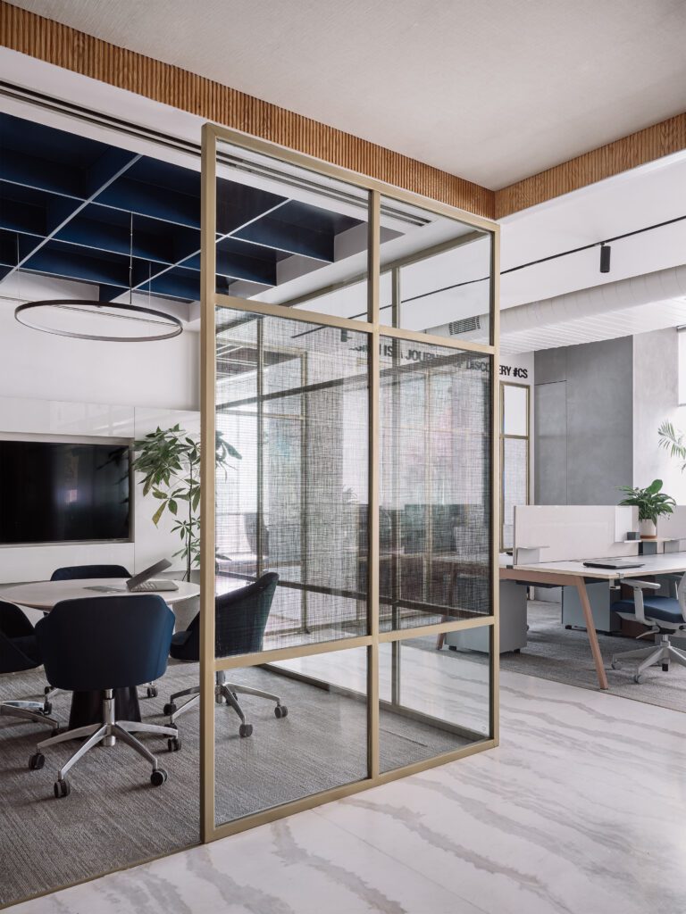
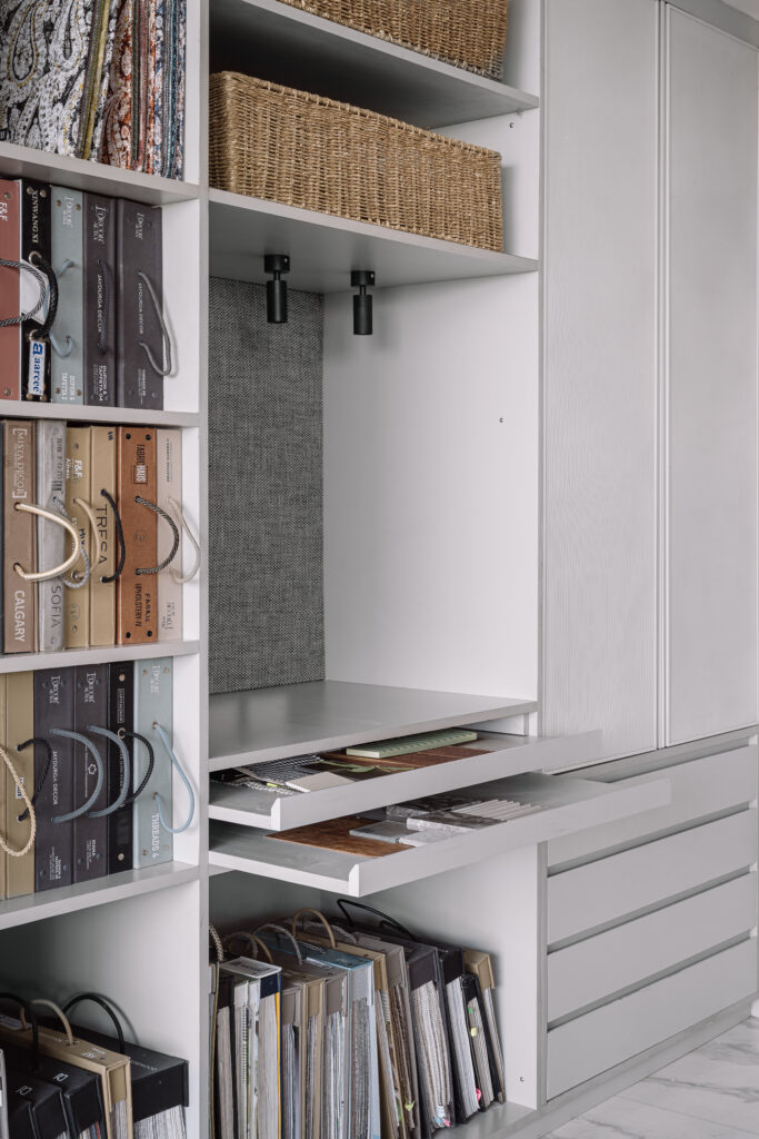
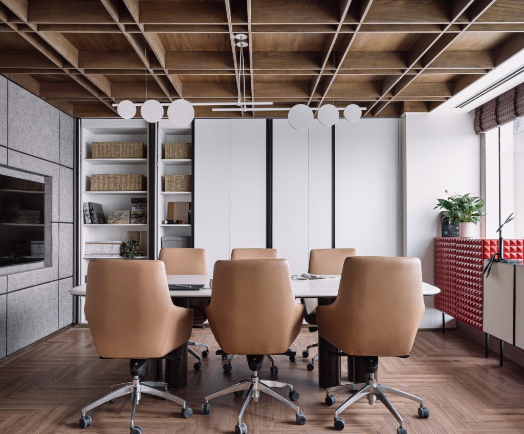
Sitting across the corridor, the second meeting room dons a similar aesthetic as the former with a few key differences. Encased within a brushed brass and clear glass partition system, this meeting space is primarily utilised for interviews and quick reviews. Kudos to its visually porous envelope, the room is always tethered to the larger construct of surrounding zones while preserving a feeling of privacy. This space also anchors a sequestered column that hosts hidden storage, making the most of its compact square footage. Steeped in a medley of warm tones and boundless urban views, the third meeting room beholds studio members and clients coming together to immerse themselves in a tête-àtête around design. Views of the coffered, veneer-clad ceiling frame the room, imbuing a dynamic look and feel. The custom white marble-topped conference table is paired with the light terracotta Shearling chairs, forming the spatial nucleus. The Hatsu pendant stretches over the discussion zone, enunciating the expansive table’s geometry. The pocket door system by Salice with the Exedra mechanism sheathes an interior wall, masquerading as a cohesive elevation which conceals umpteen storage within its internal volume, especially as the unit actively holds physical material samples and swatches. Intriguingly, the same pocket door system leads into an unrevealed and entirely acoustically-panelled ‘meditation/scream room’, which can be accessed by studio members/visitors to experience a private moment of silence during an overwhelming day!
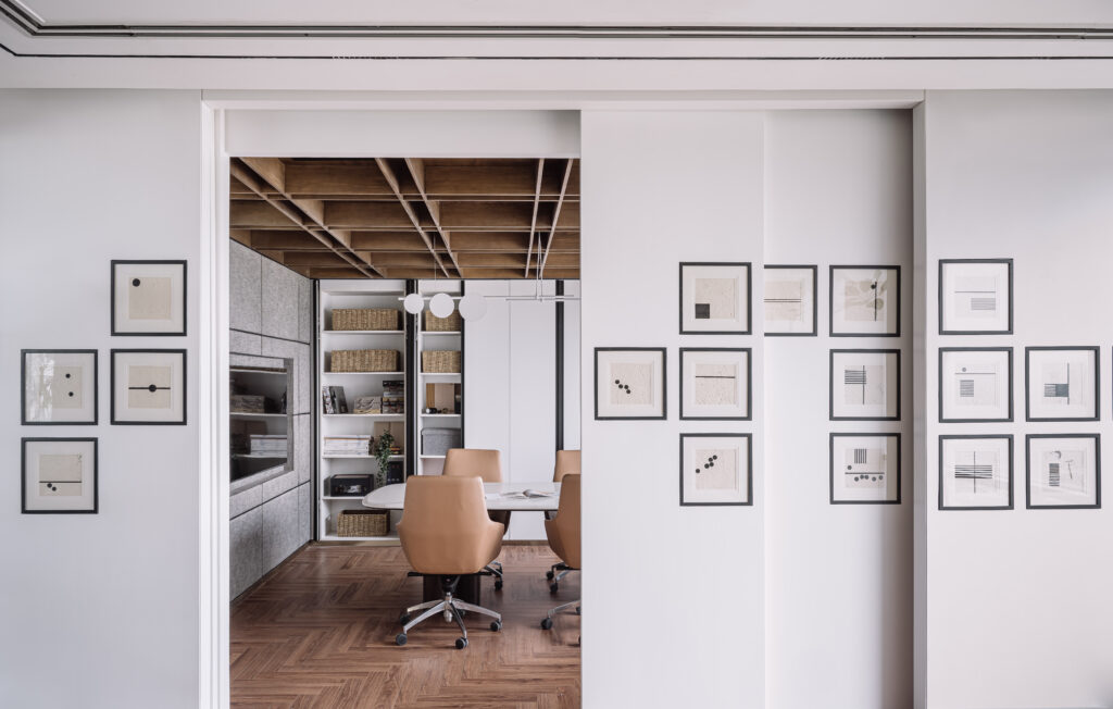
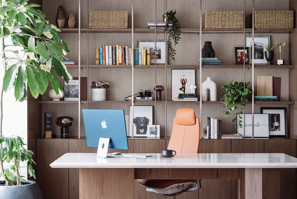
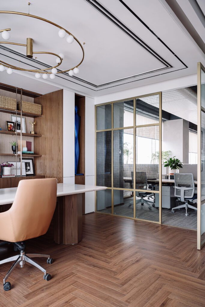
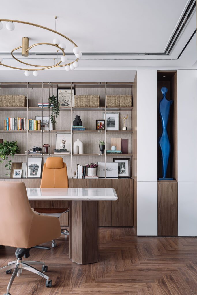
A duo of custom consoles of varying heights borders the room on one end, providing an opportunity for the team to demonstrate furniture ergonomics to clients. The fiery, crimson red console comprises a three-dimensional fascia, complete with a bevy of pyramidical components, adding an unmissable accent of colour to the neutral space. This zone links via a sliding door system to the studio head’s cabin, constructing an active interface between the rooms that can be opened during discussions/closed on a whim. A haven for the Principal Designer, the studio head cabin gracefully emulates the firm’s design persona. The space melds into the communal centre of the office on one side and the larger meeting room on the other. The light-suffused room is swathed in herringbone flooring by Inaaya Homes and fringed by the skyline’s ever-morphing views, lending it a charged milieu. A customised design desk in Corian Quartz with bevelled edges has been coupled with a head chair by Haworth and visitor chairs by Shearling. The Hatsu Swirl pendant fixture doubles up as the objet d’art in this area, adding a luxe touch with its entwined gilded structure. The desk’s backdrop comprises an open-faced shelving and storage system in veneer, textured wallpaper, and brushed brass. The bric-a-brac populating the shelves is a culmination of collectables, artefacts, and mementos curated by Priyanka over travels spanning many years. This ensures that the background of her workspace is constantly in flux, transforming with every new addition. On the other end, a collage of monochrome geometric art prints dots the sliding partition system, concocting a gallery wall when the meeting room is closed off from the studio head cabin.
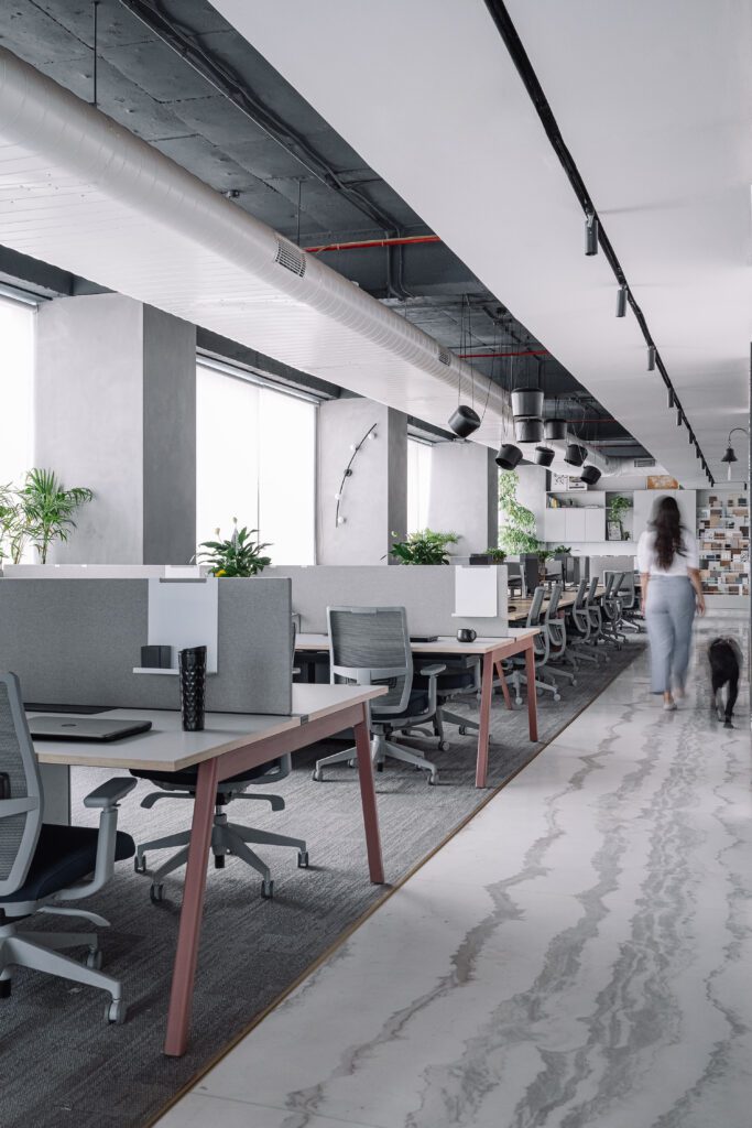
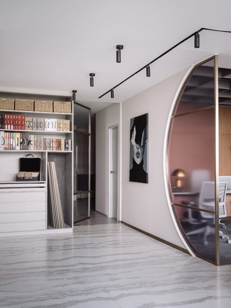
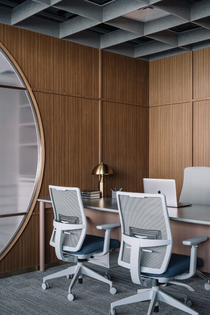
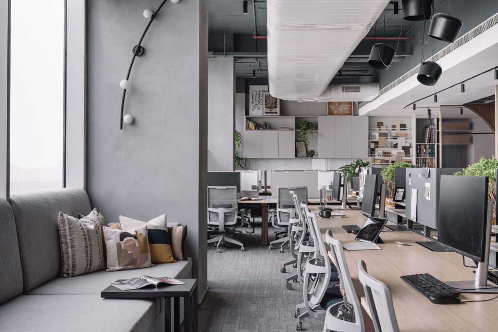
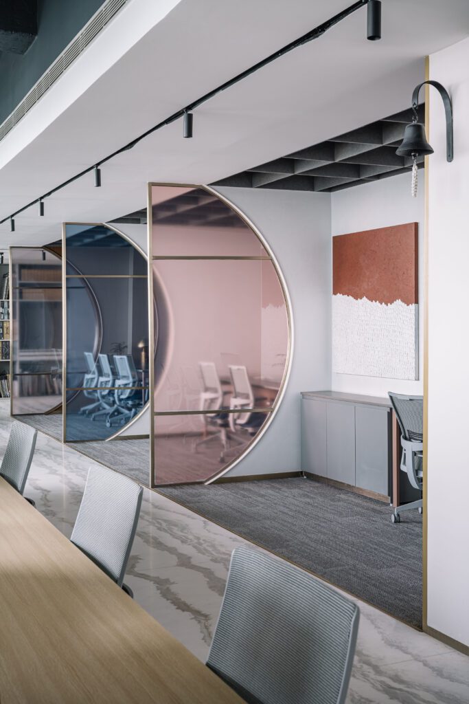
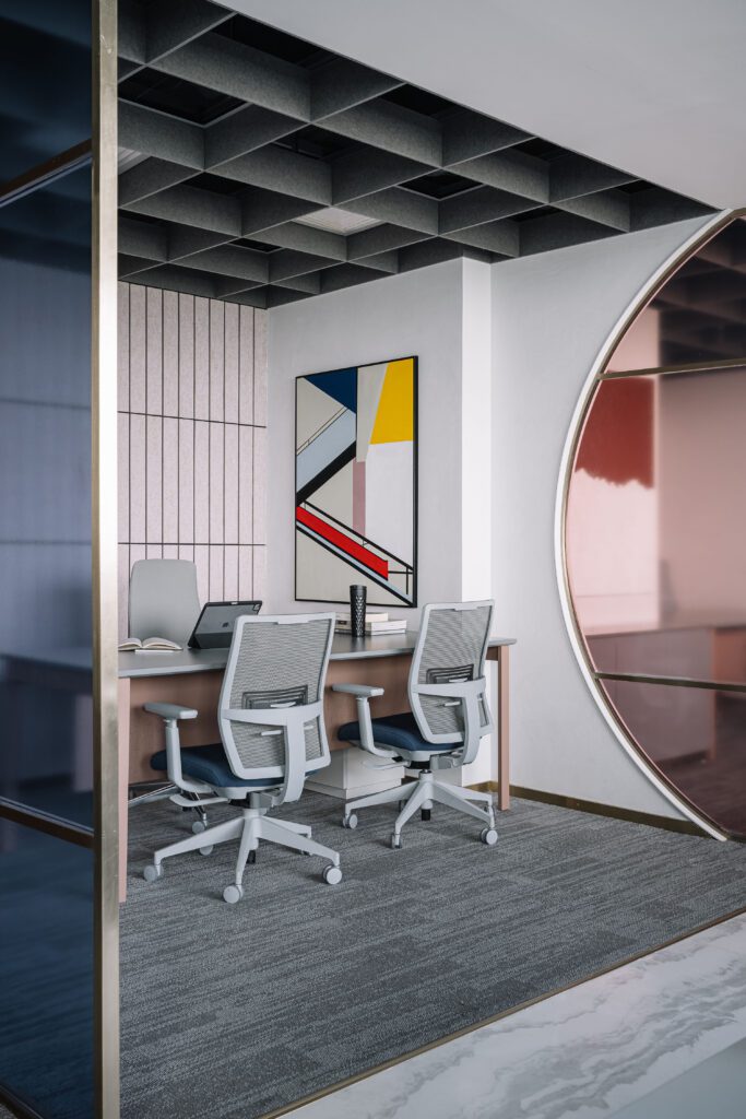
Defining the studio’s core, the workstation bay hosts the team members, bringing all the departments together. This area is peppered in tones of grey through the shell, lightshaded wood furniture by Haworth, whites, and slivers of greenery to simulate a zen and focused environment. The length of the bay harbours the ‘designer’s hub’, a 12-seater communal desk that is privy to active exchanges and collaboration as the team surrounds themselves with their peers. A suave, matte black luminaire extends across the desk’s length, adeptly illuminating the workstations with task illumination. Lining the designer’s hub, a continuous segment of wall-anchored ledge seating creates an informal spot for the team to work, lounge, or converse while indulging in framed vignettes of the city below. The sculptural Hatsu Comet wall sconces layer these nooks, elevating the ambience. Delineating the axis of the rectilinear volume, a trio of identical open-plan cabins punctuate the perimeter of the space; the veneer-panelled unit is occupied by the COO, particularly. Inhabited by the company’s senior officials, these zones offer privacy to their users within acoustically-panelled enclosures while ensuring that they remain a cohesive part of the larger layout. The partition systems segregating these cabins have been inspired by Studio 13, Architects. Priyanka had the opportunity to meet the Principal Designers of the studio earlier this year and was in awe of the ingenious intervention they had incorporated in the Istanbul Barry Callebaut Office. Reaping inspiration from their design detail, Chalk Studio channelled their own version of the partition system, blending a sweeping curved silhouette with pale-hued diaphanous glass in clear, pink, and blue finishes. The material and catalogue library is constructed in a dedicated zone towards the end of the floor plan, which acts as a physical repository for the team to peruse and study. Storing everything from 4-foot tile samples to the tomes of swatches, the library houses pragmatic storage provisions for materials belonging to active projects at the studio. Leading further into the auxiliary portions of the office, the archives room, an open pantry, coffee station, and a staff meal booth lie tucked away from the workspace.
The Chalk Studio Office succeeds in imprinting its culture of collaboration into the physical expanse of the space. The studio dismisses the oppression of stark divisions spatially and mentally. It tips its hat to the Chalk Studio Tribe, which fosters the notion of dwelling within and dreaming of immaculate design for years to come!
Fact File:
Project Name & Location – Chalk Studio Office, Gurgaon
Typology and Square Footage : Design Studio Workspace, 3,000 Square Feet
Interior Design Firm – Chalk Studio
Principal Designer and Founder – Priyanka Singh
Design Team – Priyanka Singh (Studio Head), Deepak Sharma (Interior Designer), Dhruv
Saini (Project Manager)
Text Credit – Lavanya Chopra
Photography Credit – Ishita Sitwala