There is a particular design philosophy that asks not what a home should look like, but what it should feel like to come home to. Simplécede Architect & Interiors has built a practice around exactly this question, and in Mrida, a 2,000 square foot apartment in Bangalore, that inquiry finds its most complete answer yet. The name itself is telling: mrida, from Sanskrit, means earth, soft earth, the kind that yields underfoot and holds warmth long after the sun has moved on. That quality, yielding yet grounded, is what the studio has translated into every corner of this three-bedroom home.
The project brief, as is often the case with Simplécede’s most resolved work, was not about a style. It was about a feeling: a home with the warmth of something made slowly, over time, with care. The studio responded with a material language built on exposed brick, warm-toned timber, and limewash plaster in hues drawn from the earth itself, terracotta, sand, and a soft blush that reads almost like the last light before dusk. What keeps the palette from tipping into nostalgia is the discipline with which it is deployed. Every room earns its warmth; none of them simply announce it.
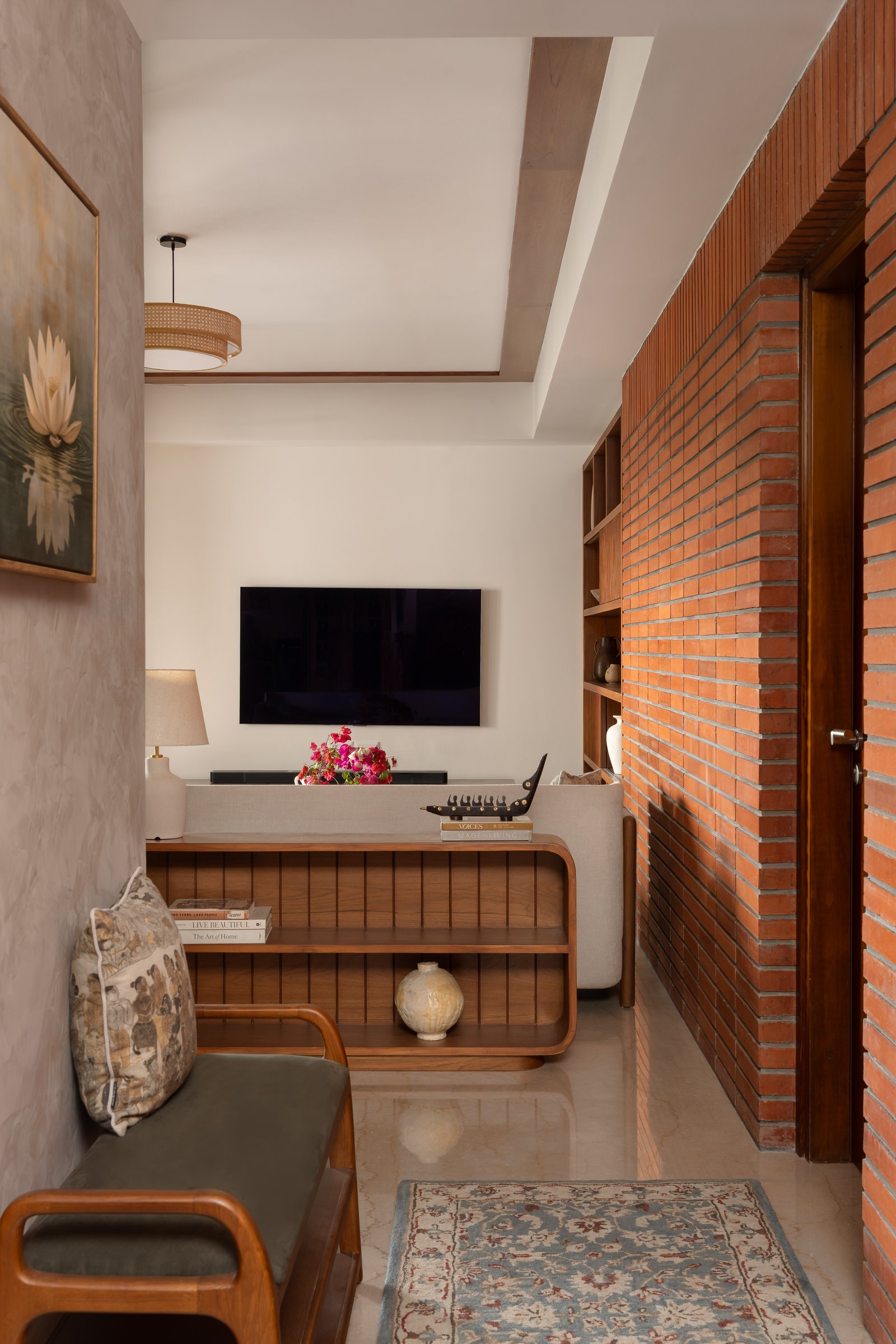
The foyer opens into the living zone in a single compressed-then-released move that is entirely intentional. A full-height wall of exposed brick in the warm orange-red of Bangalore’s older residential fabric runs along the right, establishing the material argument before a single piece of furniture has been processed. Against it, a custom timber shelving unit with rounded lower edges bridges the entry and living areas, functioning as both room divider and display surface.
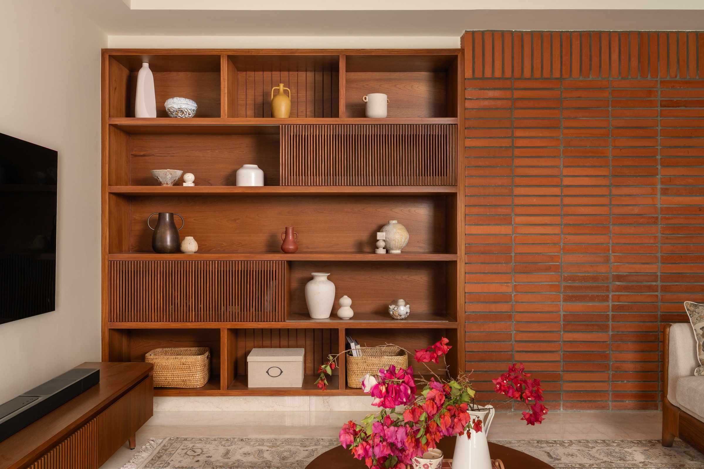
The floor-to-ceiling timber display unit that anchors the living room wall is the space’s governing gesture. Its shelving is deliberately irregular in its rhythm, alternating open bays with fluted sliding door panels, so that what might have been a storage wall becomes instead a composition, one that rewards sustained looking. The brick wall beside it, seen in full here without the foyer’s compression, confirms that the relationship between these two surfaces is the room’s central argument: the rawness of fired earth alongside the warmth of worked timber, each making the other more itself.
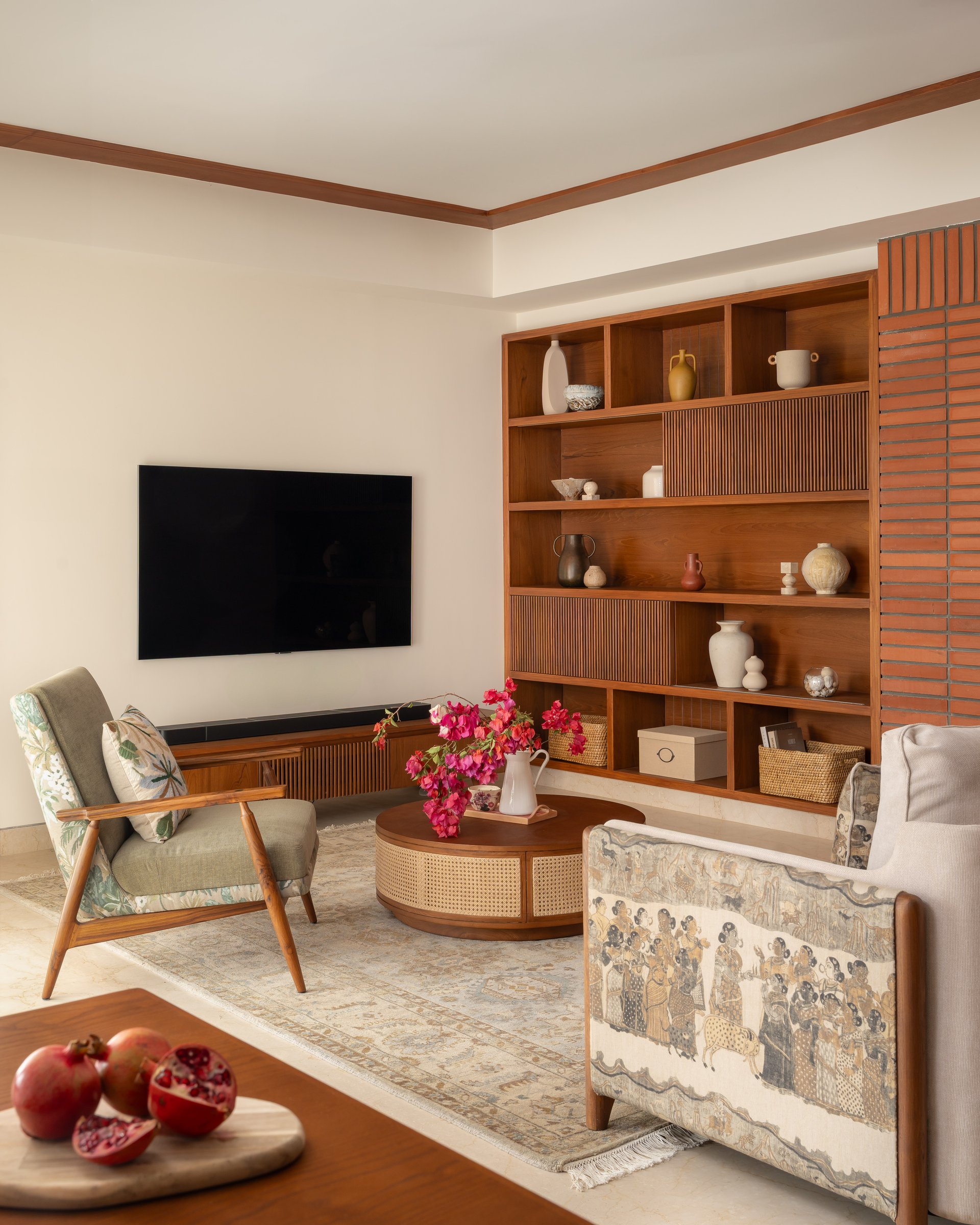
The living room reveals a composition carefully attuned to scale and proportion. A pair of timber-framed armchairs anchor the seating arrangement, one upholstered in a botanical print and the other in a figurative Indian textile, placed in quiet dialogue across a cane-wrapped circular coffee table. The decision to retain the same structural form while varying the upholstery introduces a layered visual narrative, allowing contrast to emerge without disrupting the room’s cohesion.
This interplay of elements reflects a home that has been assembled with instinct rather than imposed styling. There is a natural rhythm to the space, where material, pattern, and form coexist with ease. The room does not seek to impress through excess; instead, it settles into a sense of lived-in refinement, where domesticity is not staged, but simply and confidently experienced.
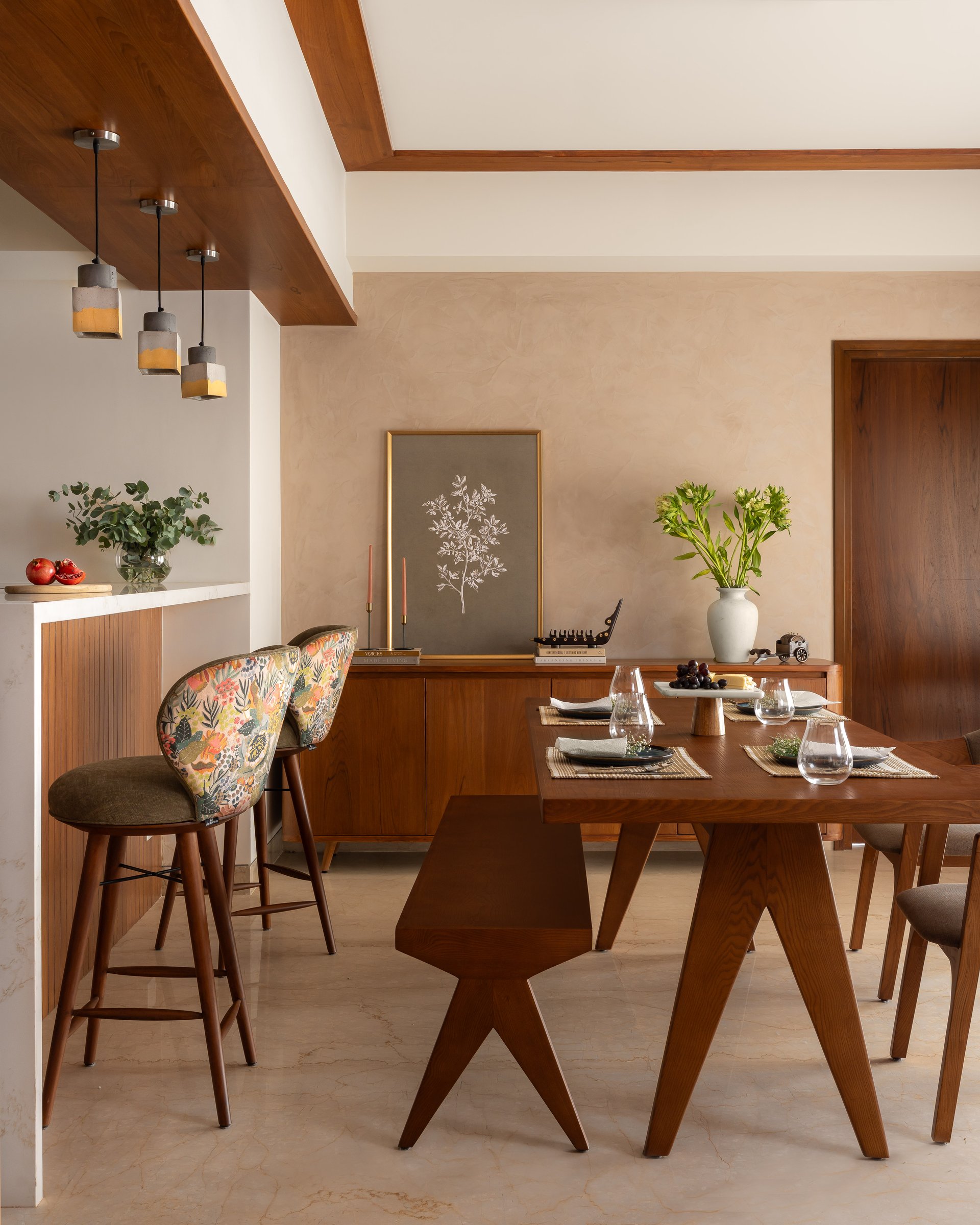
The dining area, framed by the same timber cornice detailing that runs throughout the apartment, gently shifts the mood from settled warmth to a more animated spatial expression. Cluster pendants in concrete and brass-toned ceramic are suspended above the kitchen counter bar, their sculptural presence introducing a sense of vertical rhythm within a zone that remains visually open to both the kitchen and dining table.
The dining chairs, defined by their solid timber X-base legs, draw from Chandigarh’s institutional furniture language, reinterpreted here within a more intimate, domestic setting. This subtle reference grounds the space in design history while allowing it to feel personal and lived-in, balancing architectural clarity with everyday comfort.
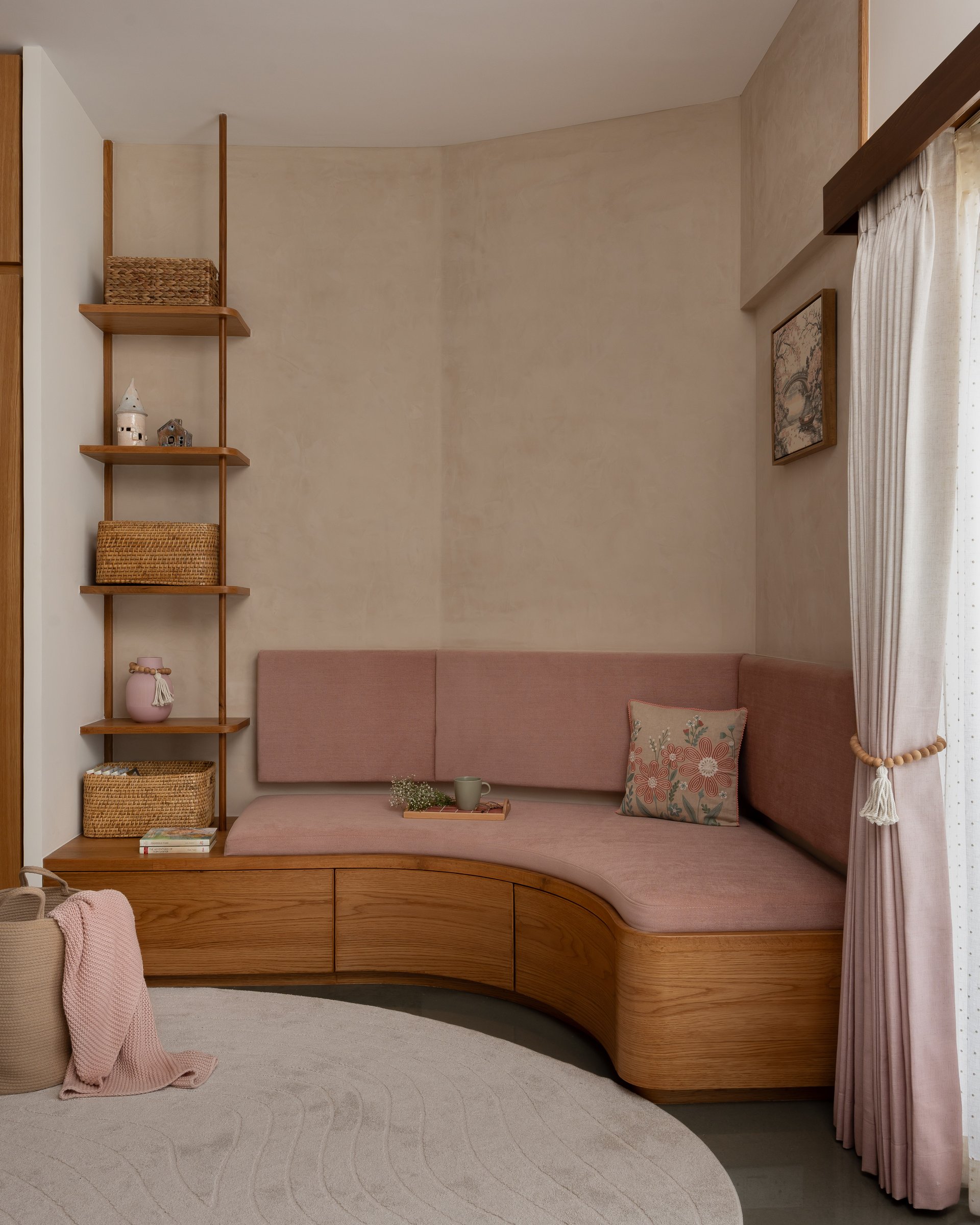
The children’s bedroom is conceived around a balance that does not force a choice between softness and spatial discipline. A curved bay seat in dusty rose velvet wraps gently around the window corner, its timber base integrating storage drawers that keep the floor plane clear and uninterrupted. The gesture is both functional and intuitive, allowing the room to remain open while accommodating everyday use.
The curve itself is not ornamental but spatially purposeful, easing the rigidity of the room’s orthogonal lines in a manner that is subtle yet deeply felt. It introduces a sense of comfort that is experienced instinctively, shaping the atmosphere of the space without drawing attention to its intent.
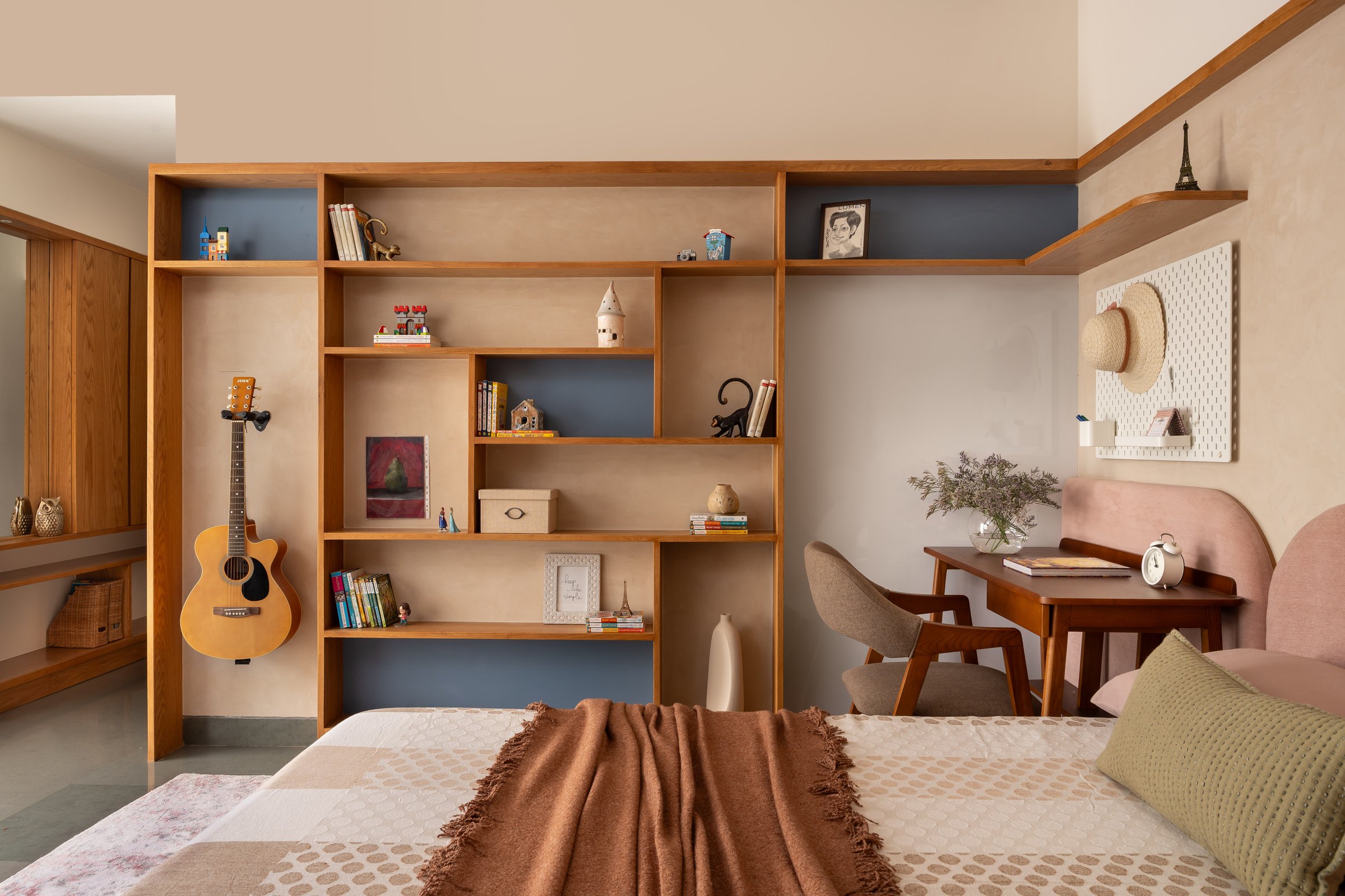
Opposite the bay seat, a full-height open shelving unit spans the wall, transforming the child’s personal archive into the room’s primary visual language. Books, toys, a wall-mounted guitar, and collected objects are not concealed but composed, allowing the space to feel layered and personal. Denim-blue back panels in the upper section introduce colour with restraint, eliminating the need for additional surface treatments while still adding depth.
The study desk and chair are positioned beside the bed, seamlessly integrated into the shelving’s overall composition rather than treated as a separate insert. This approach allows work, rest, and play to coexist within a unified spatial field, without hierarchy or segmentation. The result is a room that feels intuitive and lived-in, designed for a person rather than constructed as a stylised idea of childhood.
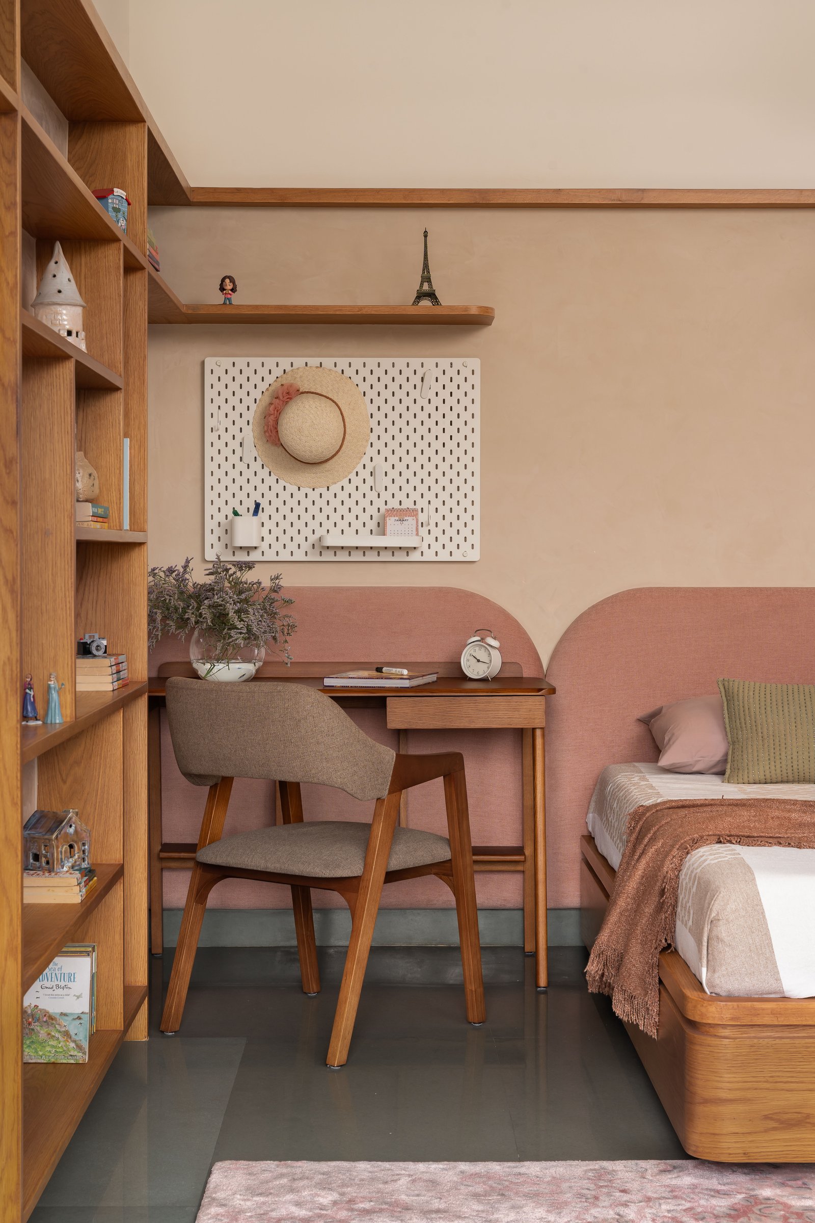
The study desk is positioned precisely between the shelving unit and the bed’s upholstered headboard, its proportions calibrated to feel efficient yet never constrained. Above it, a perforated pegboard panel introduces a layer of functionality, allowing for everyday organisation while adding a subtle textural dimension to the wall. Its crisp white surface acts as a quiet counterpoint to the warmth of the surrounding timber palette.
The headboard, defined by a gentle arched profile and finished in the same dusty rose as the bay seat, establishes a visual continuity across the room. This shared form and colour bring cohesion to the space, lending the composition a sense of balance without relying on overt symmetry.
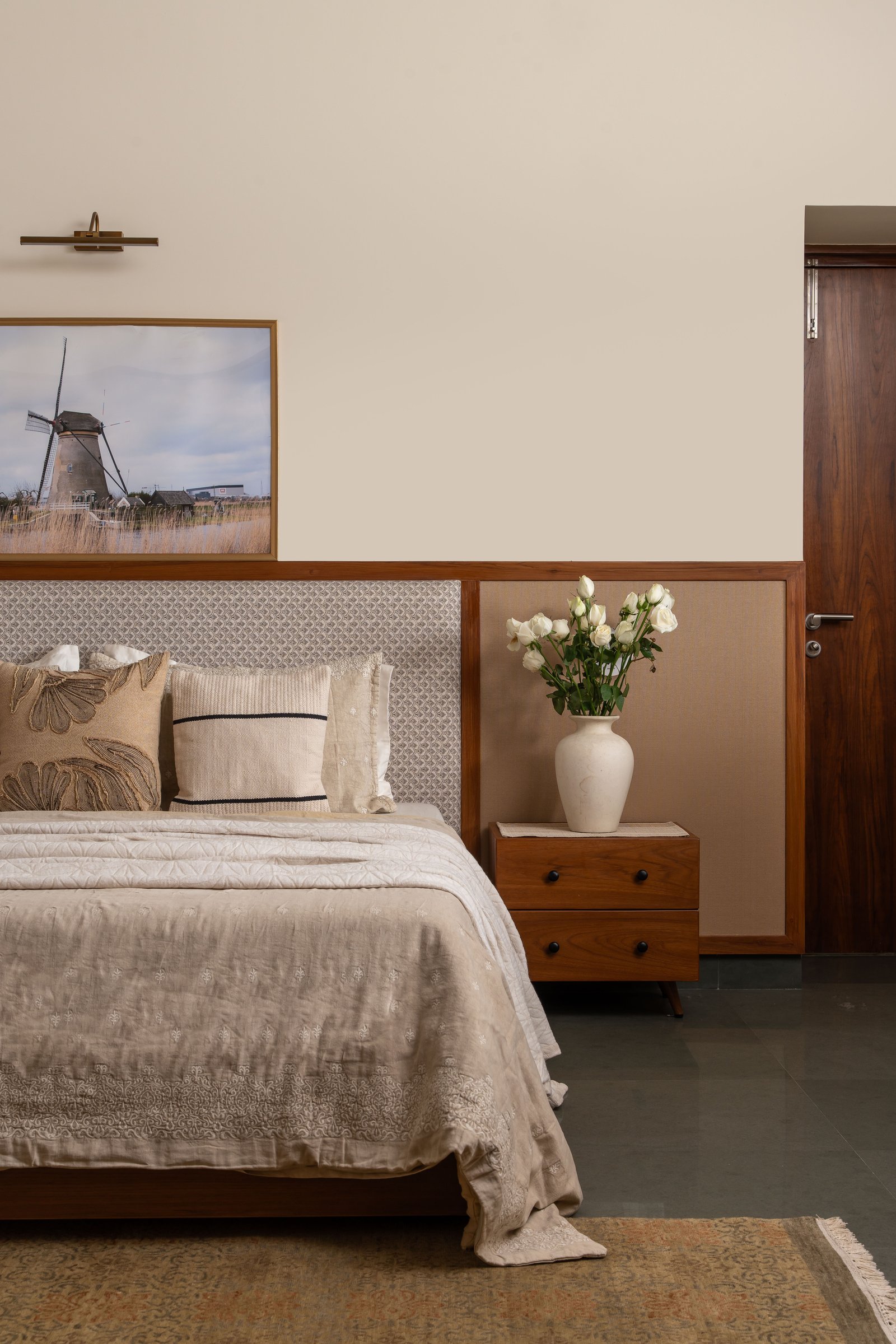
The master bedroom is where the studio’s restraint is most evident, and most affecting. A wainscot-height timber panel spans the full width of the bed wall, framing the upholstered headboard alongside flanking bedside panels in a sandy linen tone. This layering mediates gently between the warmth of the timber and the coolness of the pale plaster above, creating a composition that feels calm and resolved.
Above the bed, a large landscape photograph in a timber frame is illuminated by a single brass picture light, allowing the wall to read as a unified arrangement rather than a collection of elements. There is a quiet clarity to the space, where every component feels deliberate yet unforced, and the room settles into a pace that encourages stillness.
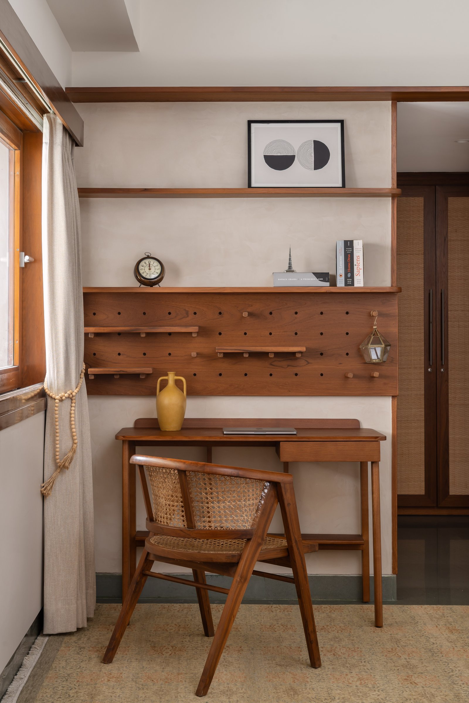
The study nook, tucked against the window, is conceived as a finely crafted workspace anchored by a custom timber pegboard wall panel. Detailed with precision-drilled perforations, it accommodates adjustable timber pegs and shelves, allowing the composition to evolve alongside the owner’s working habits. The system brings flexibility without visual clutter, maintaining a sense of order while remaining quietly adaptable.
A cane-back timber chair at the writing desk introduces a layer of textural softness, offsetting what could otherwise read as a purely functional corner. Here, the design reveals its depth, where utility and craft converge to create elements that are as considered in use as they are in form, elevating the space beyond surface-level styling.
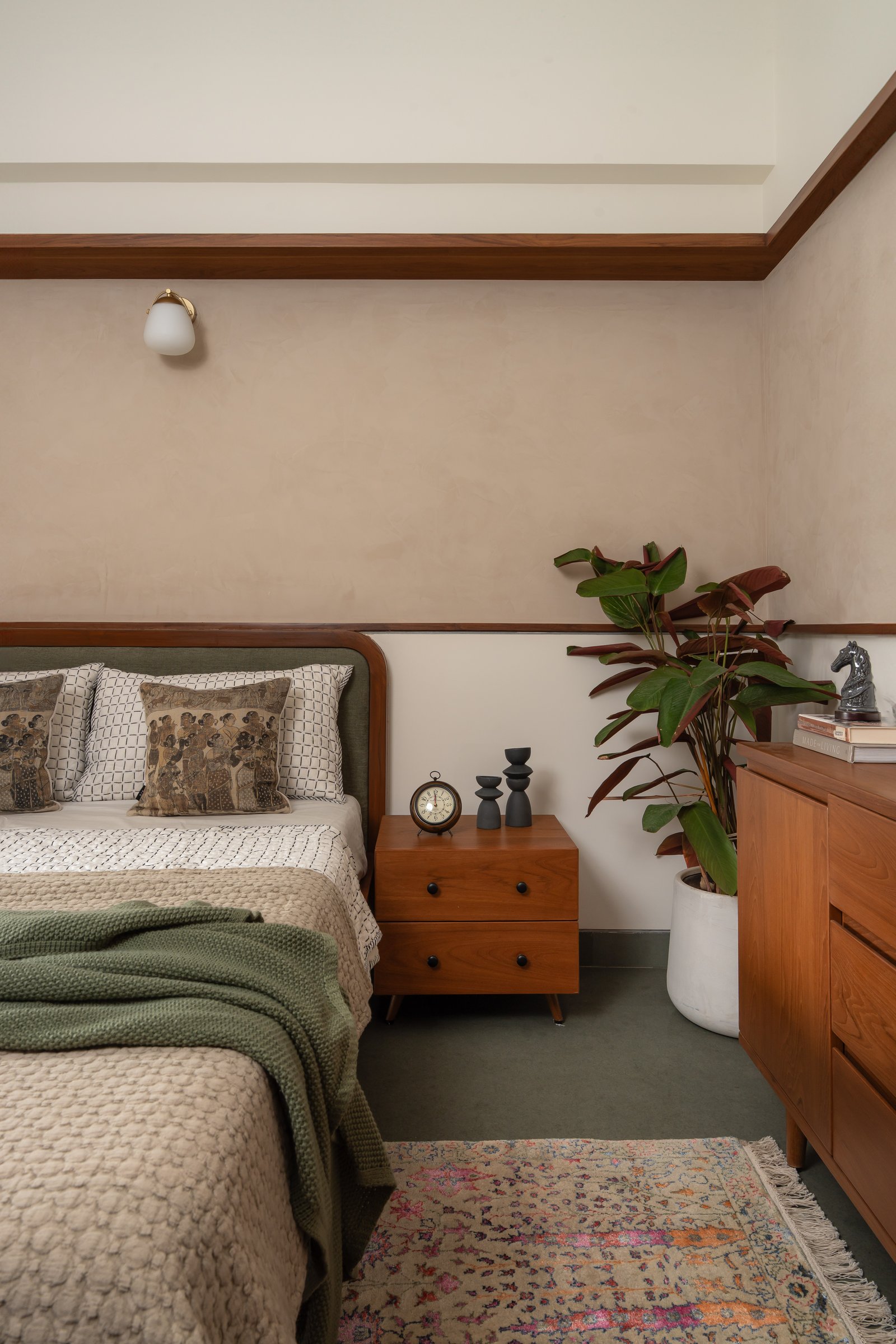
The guest bedroom addresses its brief with a quiet sense of economy. The limewash plaster walls and timber cornice detailing continue seamlessly from the rest of the apartment, ensuring the space remains grounded within the home’s broader material language rather than set apart from it. This continuity lends the room a sense of belonging, allowing it to feel integrated rather than incidental.
A curved headboard in forest green upholstery introduces the apartment’s first pronounced note of colour, balanced by the warmth of a timber chest of drawers and the deep burgundy foliage of a potted plant nearby. The composition is resolved without excess, demonstrating a clarity of intent where restraint becomes the defining gesture, and the room feels complete without the need for elaboration.
What Mrida represents within Bangalore’s residential design discourse is worth articulating. At a time when many interiors lean instinctively toward a globally contemporary language, pale stones, fluted metals, and borrowed formal gestures, Simplécede takes a more grounded approach. The palette draws from the material warmth of the subcontinent, brick, timber, patterned surfaces, and handcrafted elements, yet avoids slipping into nostalgia or overt cultural signalling. The result is a language that feels both rooted and current, reflecting a sensibility that is thoughtful, composed, and distinctly of its context.
A home named after the earth it is shaped from ultimately carries an expectation of permanence. Mrida achieves this not through age, but through the quiet accumulation of considered decisions, each element placed with clarity and intent. There is a restraint that allows spaces to breathe, where form and material work together without excess. In this lies the distinction of the project: not just in how it looks, but in the way it proposes a certain rhythm of living, measured, intuitive, and enduring.
Fact File
Project Name: Mrida
Design Studio: Simplécede Architect & Interiors
Location: Bangalore, Karnataka
Area: 2,000 sq ft
Photography: Shine Scapes (@shine.scapes)
Interior Stylist: Navneet Roopra (@navroopra_studio)