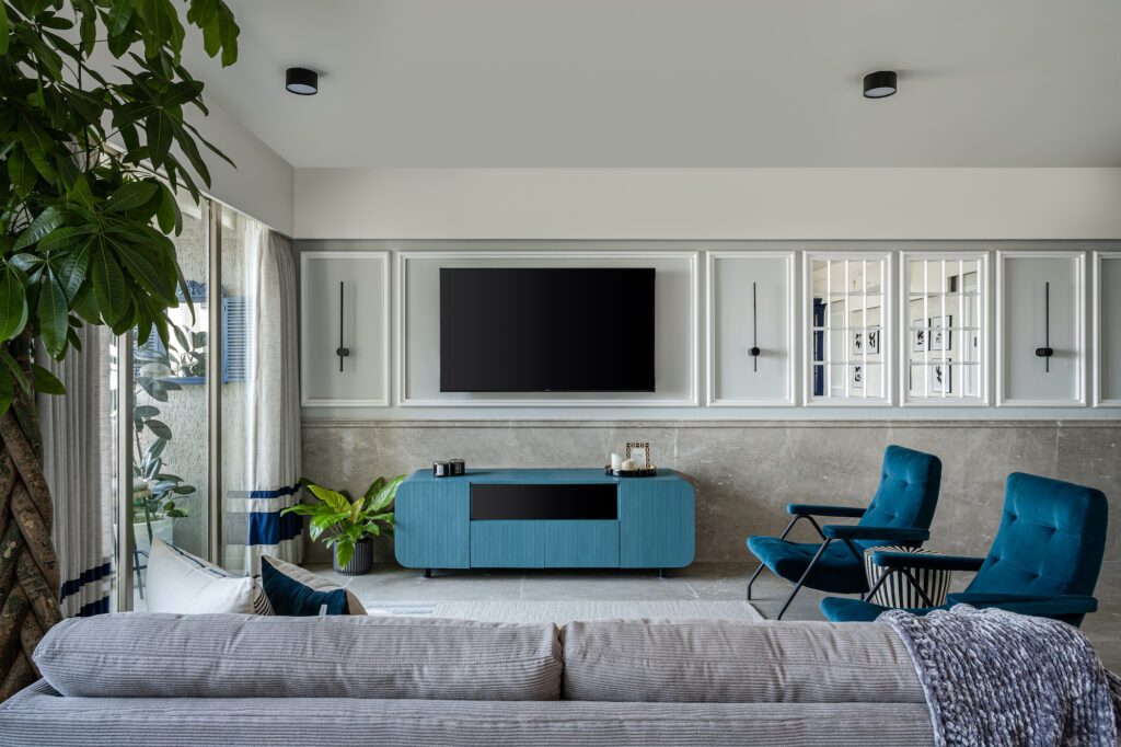
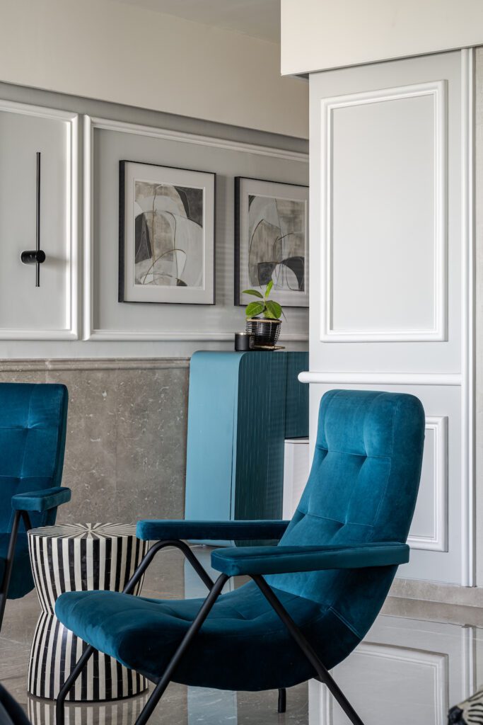
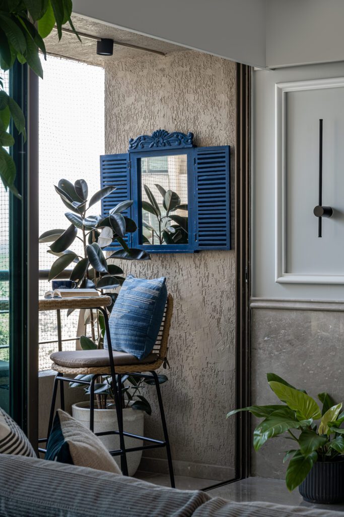
The living spaces of this house testify for the versatility of the colour – blue. The striking blue can be seen used in the furniture, fabrics and as accents in curtains. Such introduction of an element in the design adds a zest to the space and gives it an identity. The living room is laid on botticino marble flooring which extends & folds into wainscoting throughout the room, paired with mirror panelling & mouldings at the upper part. This rigid geometry is balanced out with the curves in furniture and softness of the upholstery. The room opens to a small balcony overlooking the city & letting in the natural light which lights up the room throughout the day.
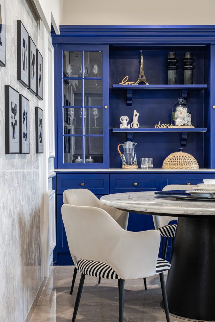
The dining area forms a beautiful cluster of furniture, each playing their part functionally & aesthetically – a stone top round table accompanied by lush dining chairs. As a backdrop stands a tall blue crockery/bar unit with a stone-top surface to work on, glass cabinets and an intricate crowning on top– becoming the focal point of the space. All furniture pieces are crafted and curated with attention to the most minute detail, from their colours to their forms to compliment the space they reside within.
“Art is a part of design” and the designer stands by those words with curated framed artworks to amplify the overall experience for the residents.
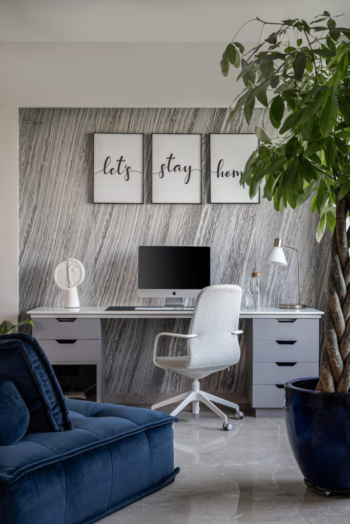
The tranquil yet stylish study space in this residence consists of a stone-top desk, placed against a stone-studded wall. As an extension to this, there is a comfy window alcove and a seating in the centre of the space where the residents can read or simply relax.
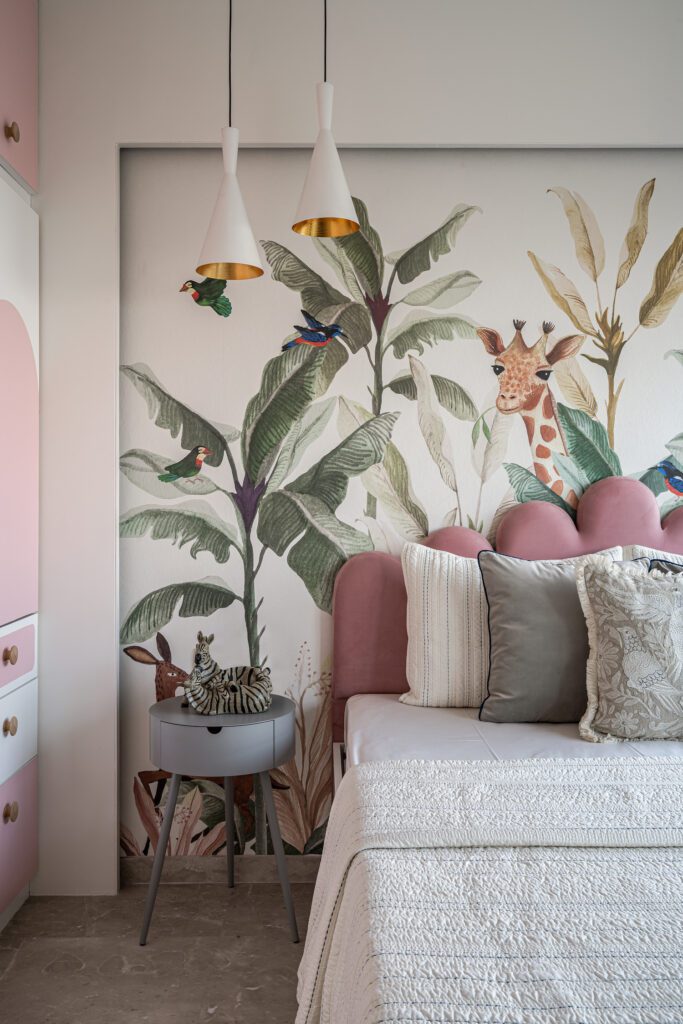
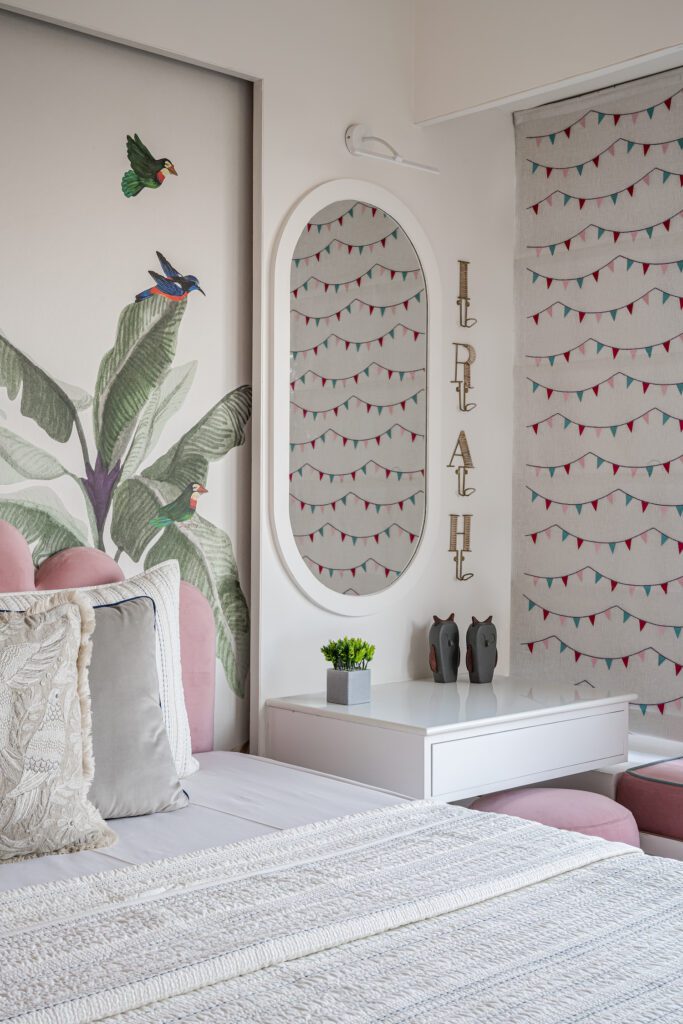
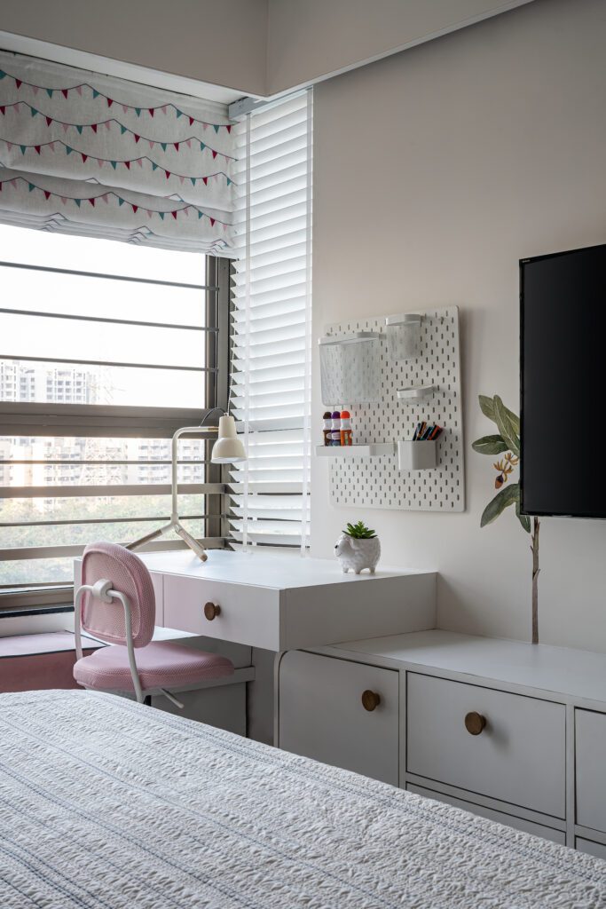
“The daughter’s room in this project is designed to be softer visually, with mild pastels and whites. To further amplify the gentle ambience of the room, we used curves in furniture and elements like mirrors are used. As a backdrop to the whole room is a custom wallpaper, a graphical representation of flora-fauna which brings in the colours that truly celebrate childhood.”
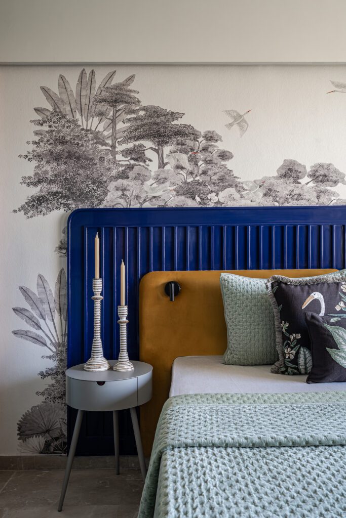
The master bedroom narrates a statement of style with blues and flutes, following the predefined language of this whole project. Compact in character this room is strategized with cohesive materials and colours. The quirky blue bed back has an interesting impact on the eyes, set against a graceful tropical wallpaper finished with accent wall sconces. The room receives a soothing amount of daylight, keeping the space bright & lively throughout the day. The muted green wardrobe has flutings in the middle to break the solidness of the surface and add a linearity to it. The whitewashed ceiling and pale dyed curtains make the room look larger spatially.
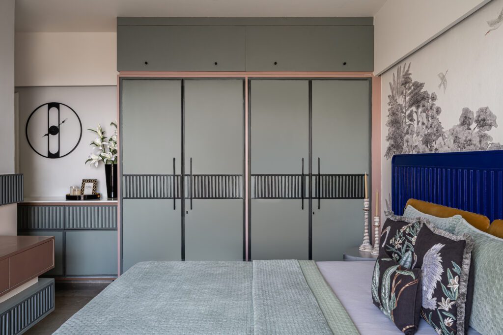
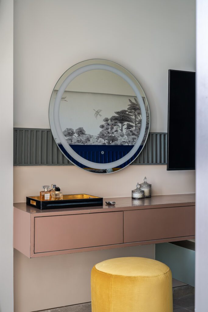
“One of the most vital requirements of the client was to have an appropriate amount of storage. Considering the limited floor space, all the rooms have ample amount of space which we placed strategically to avoid any visual crowding.”
Limited space doesn’t necessarily mean restrained design and this apartment stands proof to that. The 1000 sq.ft is utilized to create a robust residence which fits all functional needs of its residents and standing strong on their design belief of ‘God is in the Details’ the designer creates a blissful entity that is equal parts stylish & functional.
Fact File :
Design Firm : Design Salt Studio
Principal Designer : Gopal Patel
Design Team : Dhvani Parikh, Dipalee Yadav
Location : Mumbai
Area : 1,000 sq ft
Photography Credit : Noaidwin Sttudio
Content Writer – Jyot Patel